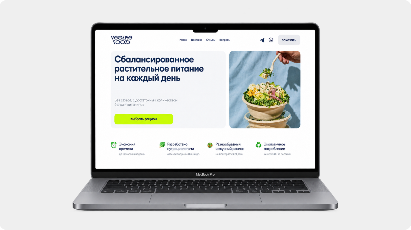
Website Redesign & Ordering Experience
Less visual noise.Clearer choices. A simpler orderingexperience.
- About
- Veglifefood is a delivery service offering balanced, plant-based meal plans. Customers choose a diet, calories and plan length on the website and get ready meals delivered to their door.
- The challenge
- The website hadn’t changed since 2017. It looked dated and busy, which undermined trust, and the first-order discount was easy to misread — it looked like a separate meal plan.
- Goals
- A full visual redesign: a modern, calm and unified visual language without visual noise.
A clear first-order discount: prominent and unambiguous inside the plan-length choice, without getting in the way of repeat orders. - My role
- Redesign of the whole website, new pages and 3D illustrations. June – July 2025.
01 / Before the redesign
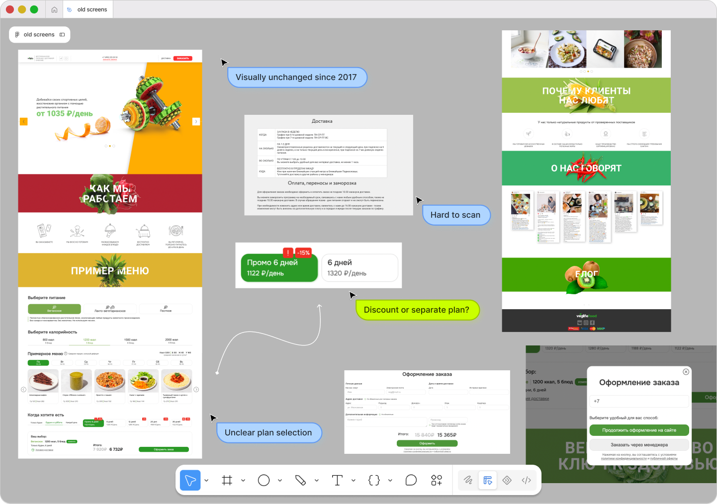
I started with an audit of the existing site. Three problems stood out:
- Outdated visual designUnchanged since 2017: bright banners, mixed styles and heavy blocks made the site feel cluttered and discouraged new users.
- Unclear discount conditionsEasy to miss, and not obvious that it applies only to the 6-day plan and only to the first order.
- Misleading “Promo week” buttonIt read as a separate plan, although it was a discount on the 6-day option, so returning customers clicked it by mistake.
02 / Homepage: from cluttered to clear
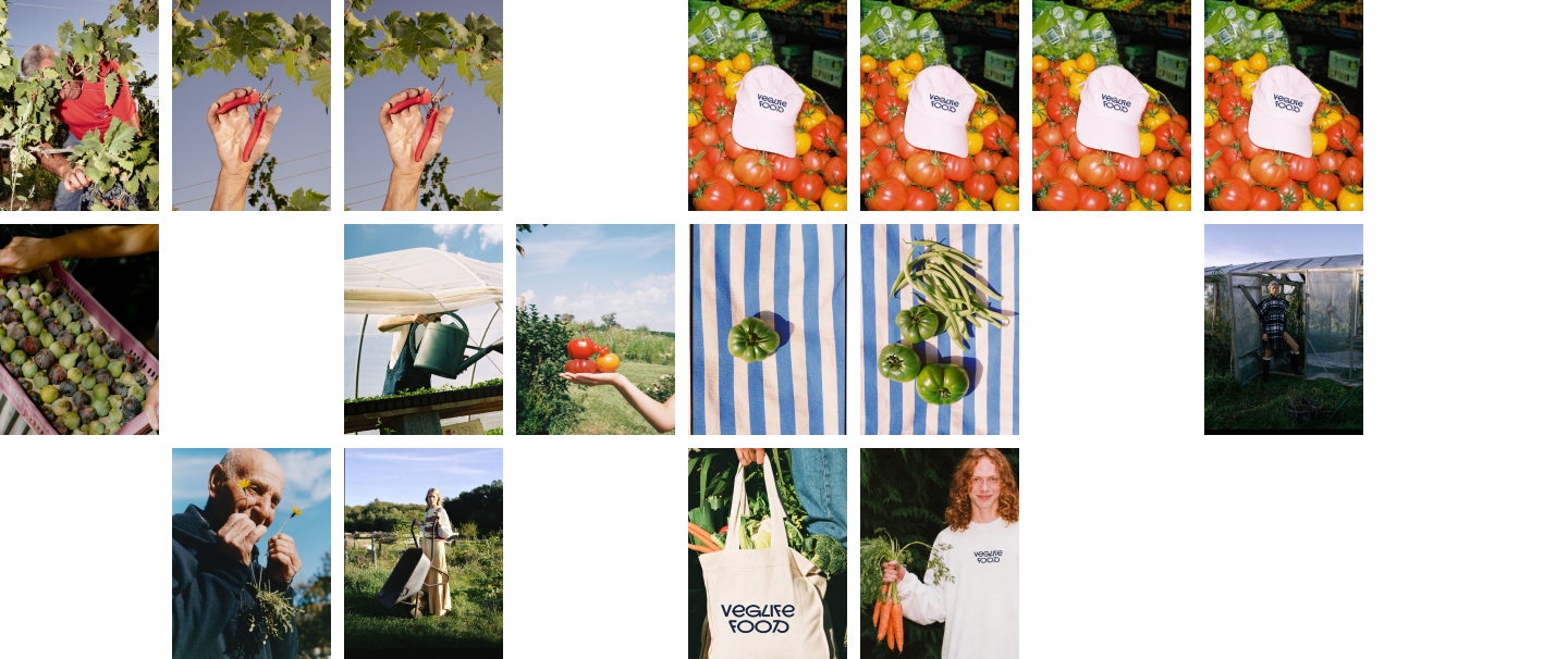
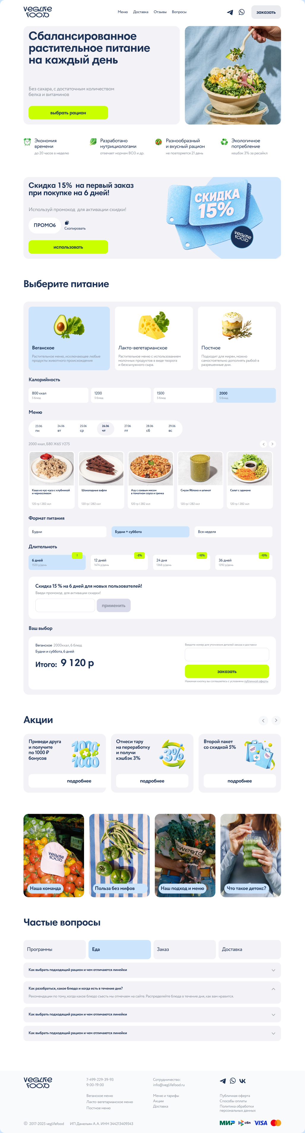
One calm visual language replaced the patchwork of loud banners. White space, a single lime accent, soft blue surfaces and real food photography make the page easy to scan, on desktop and on mobile.

03 / Components
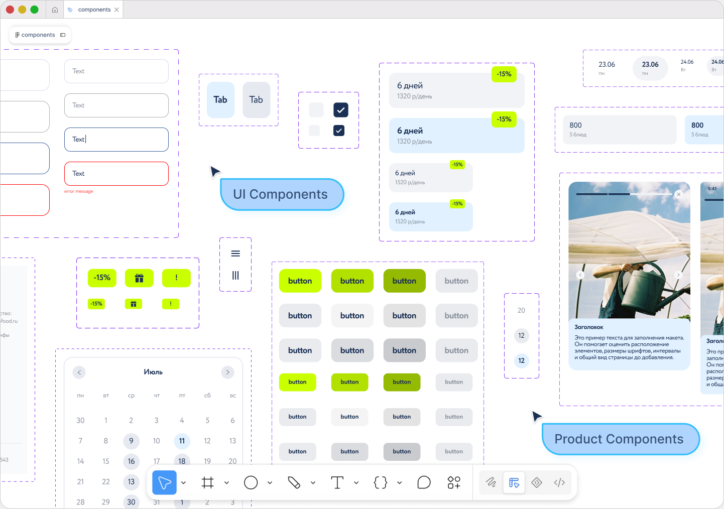
To keep the new look consistent, I put together a small component library: inputs with all their states, tabs, checkboxes, buttons, discount badges, plan-length cards, a calendar and story cards. Every new page is built from these parts.
04 / Meal-plan calculator
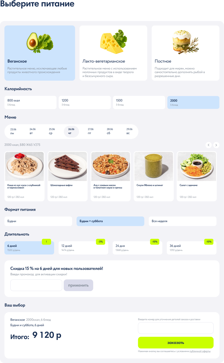
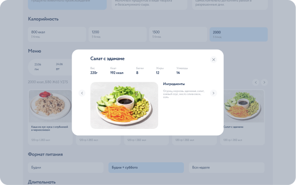
The calculator is the heart of the site. Diet type, calories, the daily menu, delivery days and plan length now read as one clear top-to-bottom flow, with the total always visible at the end. Any dish opens a card with its weight, nutrition facts and ingredients, without leaving the page.
05 / First-order discount
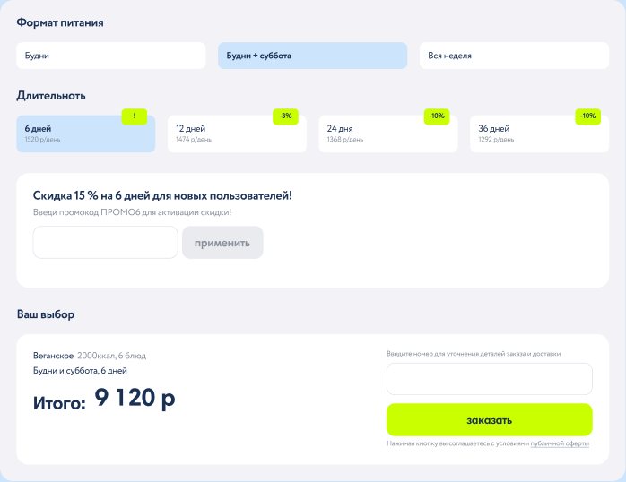
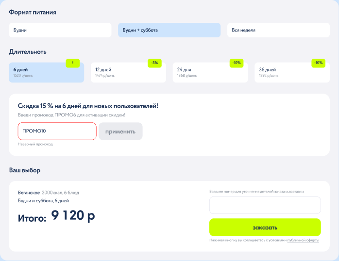
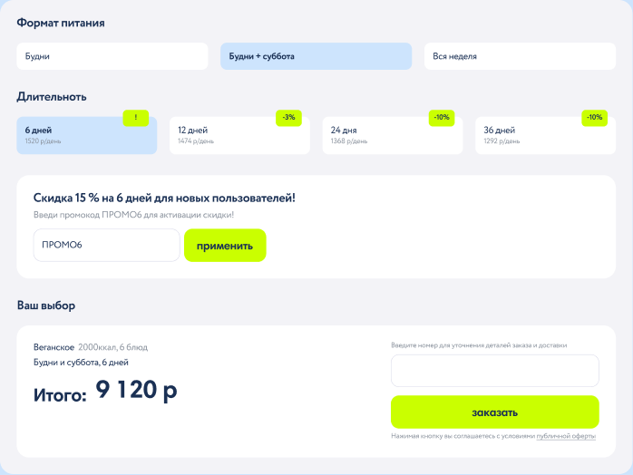
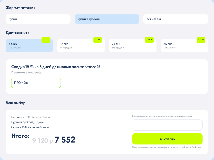
The discount no longer pretends to be a plan. It lives in its own block under the 6-day option: the headline says who it’s for and what it covers, and the promo code field sits right there. Every state is designed, and returning customers can simply skip the block.
06 / Promotions, stories & FAQ
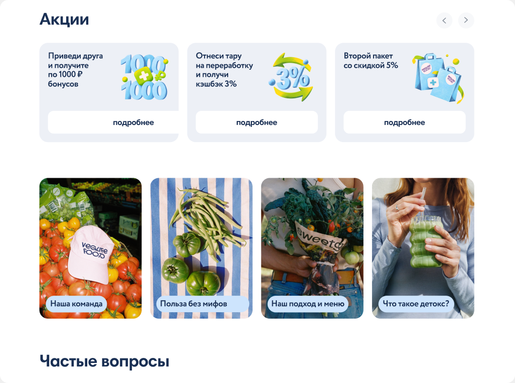
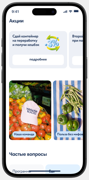
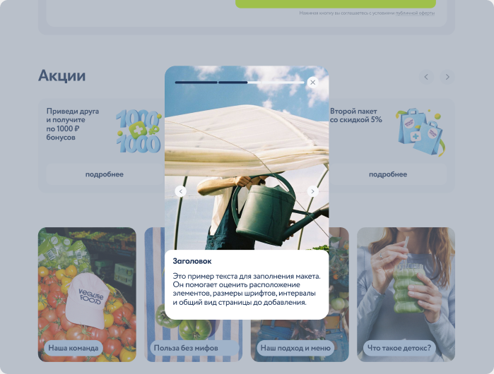
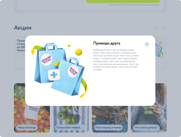
Secondary content got its own rhythm: promo cards with 3D illustrations I made for each offer, story cards about the team, the menu and the approach, and frequently asked questions. Stories open in a full-screen viewer, questions in a light modal.
07 / Checkout
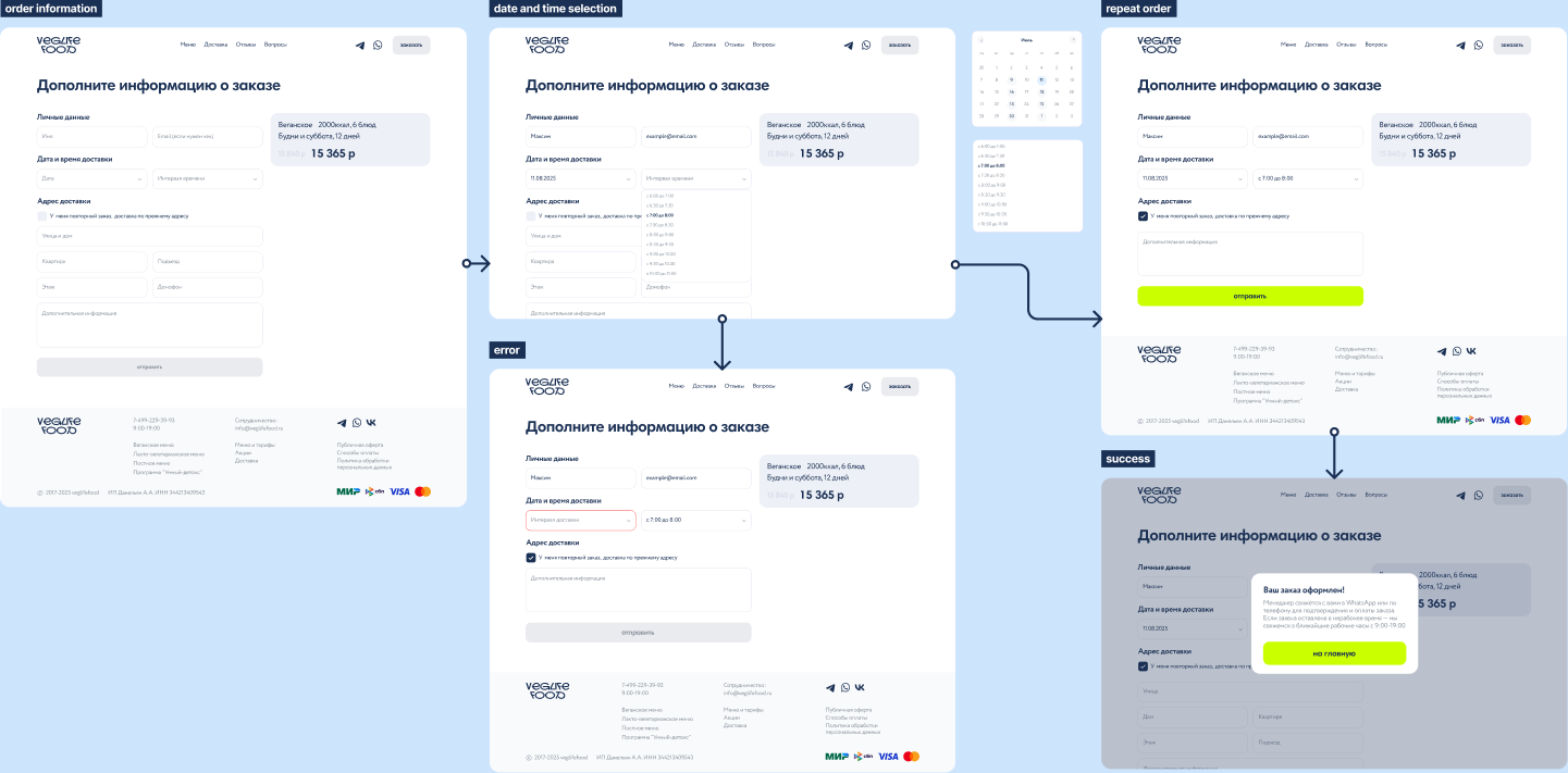
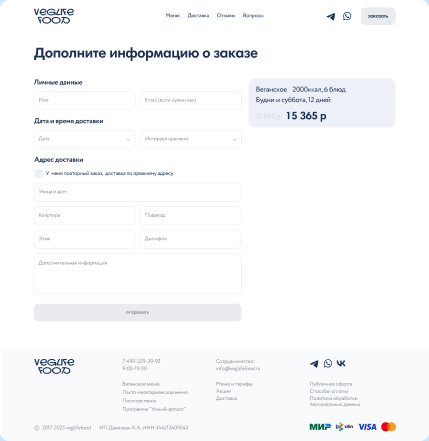
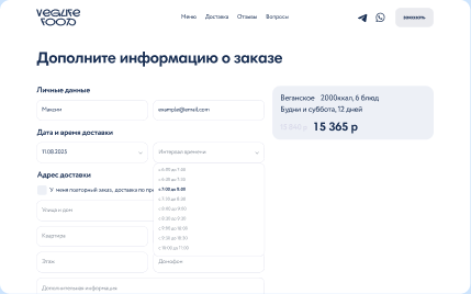
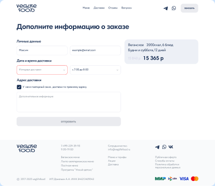
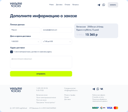
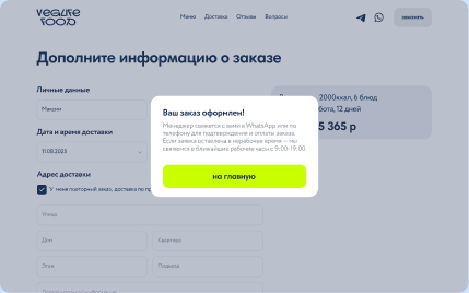
Checkout became one short form: contact details, delivery date and time, and address, with the order summary kept beside it. I designed the whole flow, including validation errors, a faster path for repeat orders and a clear success state.
08 / Result
A calm, unified website where the food comes first, ordering reads from top to bottom, and the first-order discount can’t be mistaken for a separate plan.